
Awaken Chiropractic
Dr. Erin Corrigan, DC was an awesome person to work with: I remember asking her how Awakening would look if it was a movement, and her imagination just went for it, so bravely!
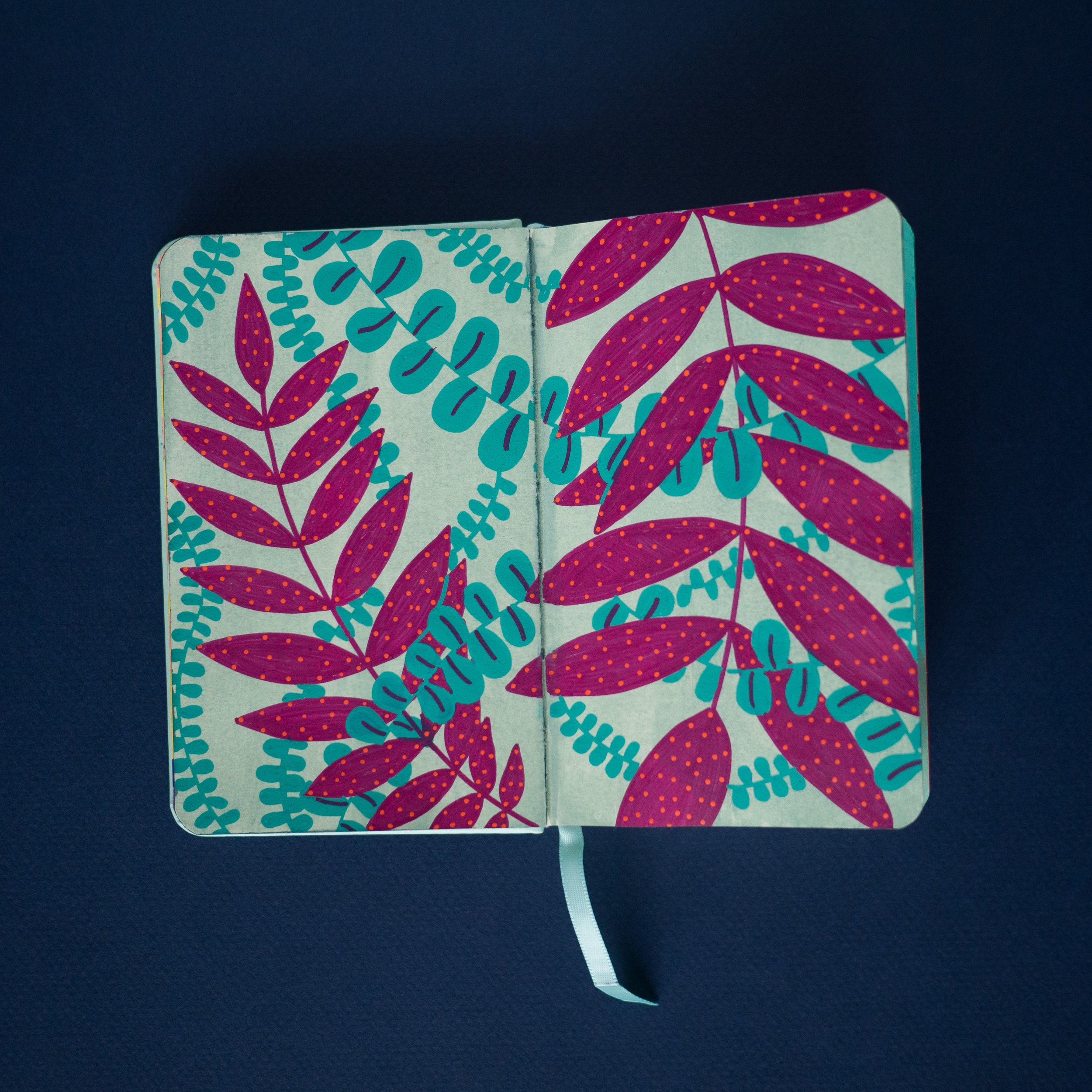
Together we developed a gorgeous handmade visual identity that resonated profoundly with our common love for nature. We translated her core values into colors, fonts, and patterns, and created the main illustration showing exactly the embodiment of Awakening that she imagined in our first call.


Care . Nature . Patience . Growth
Awaken’s logo signifies these brand values. Pastel and subtle color palette, yet energetic and comfortable, a happy one, because that is Erin’s caring approach to her patients. The leaf represents the nature of our bodies, structured and with a central spine.


Art Thinking process


For the chiropractic practice, the main focus is the spine. We then went ahead and tried to find this same structure in nature, and then integrated both ideas: the spine that shapes a leaf.
We wanted to explore how to represent the time Dr. Erin dedicates to her patients, as well as visualizing the transition from dormant to Awaken.


“Sofia’s work exceeded all of my expectations. She took the time to truly understand and develop the core values of my new business. While pushing me to think outside of my own box, she elevated my brand into a genuine piece of art. She is thoughtful, patient and a very kind person. I could not recommend her any more highly”
Dr. Erin Corrigan, DC
Chiropractor
Awaken Chiropractic